A Verizon
Brand Identity Story
Verizon and R/GA recognized that as the world continued to become more digital and data-driven, interface design increasingly defines how people connect with brands.
This proactive thinking, paired with an upcoming complete rebrand, is when the Verizon Digital Brand Identity group was born at R/GA. It’s purpose? To drive brand strategy and governance for all digital work. But it’s never that simple…in a good way.
By working smart and building a strong client relationship, we more than doubled our revenue in a few short years. All while maintaining a small core team.
How do you manage the voice and look of a brand as large as Verizon?
The goal of our team has always been to have every piece of brand work out in the world to feel 100% Verizon. With over 50 agencies and thousands of employees creating work daily, it takes a very robust system to achieve such a lofty goal. This video explains how we do it.
The Verizon Design System
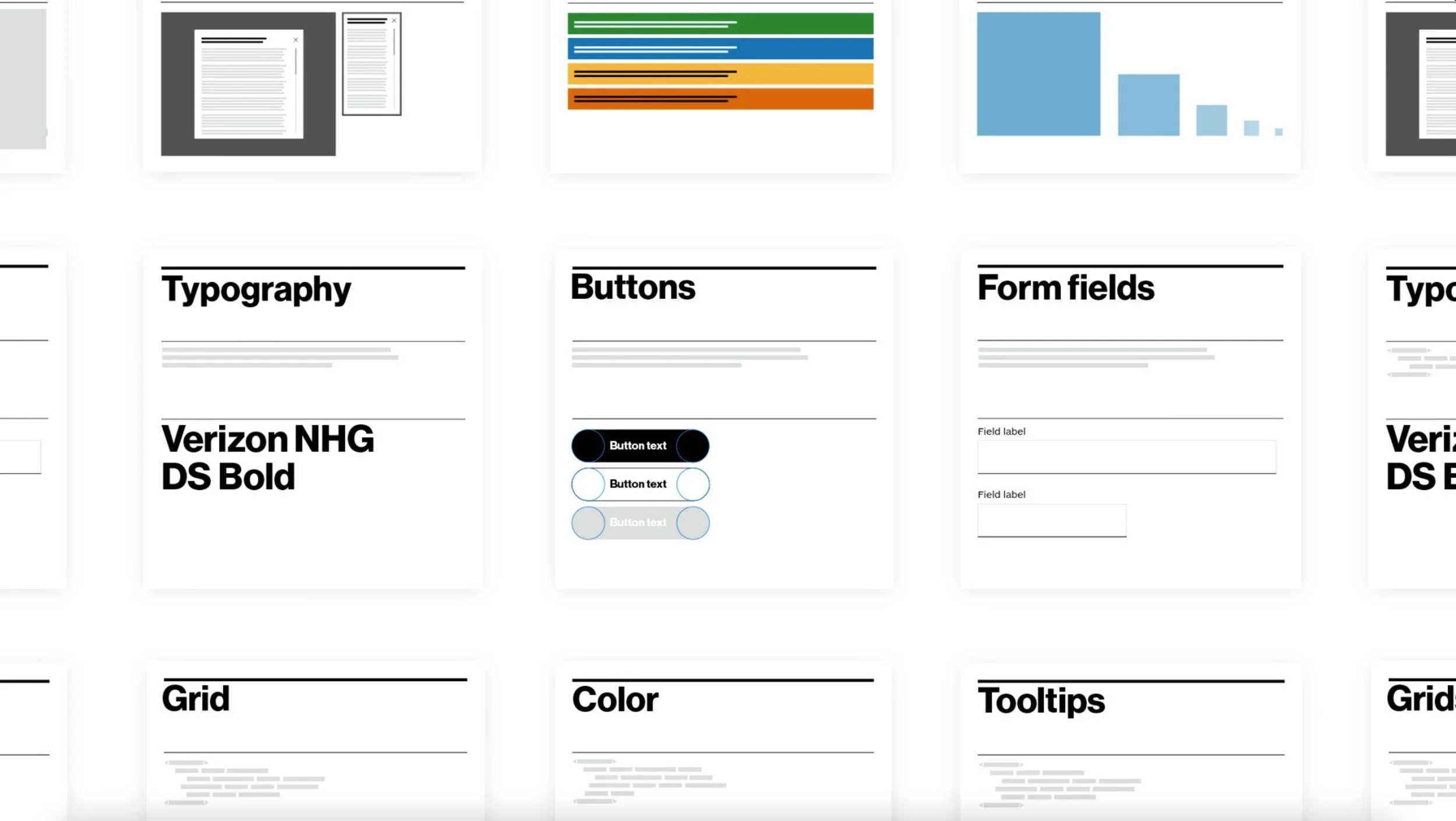
Verizon was ready for a digital design system, a huge job that would be far reaching and extremely beneficial to their vast digital landscape. Our group was tapped to work directly with the CX team at Verizon to help bring this system to life while ensuring an on-brand experience.
The purpose?
Simply, to create consistent experiences that better serve all Verizon customers via a single source of truth.
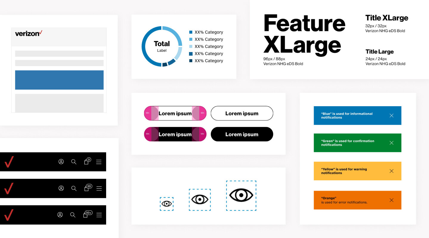
We worked continuously with the CX team at Verizon to strategize, create, test and implement the core components that make up the majority of experiences across the site.
As a key stakeholder, my role was to ensure brand consistency across all work. This included expanding the brand on the digital side to fit the always evolving needs of the current landscape.
To create excitement around the upcoming release of the new Verizon Design System, we produced a quick video to communicate how this system will solve the issues of inconsistent brand experiences with a single source of truth.
Iconography
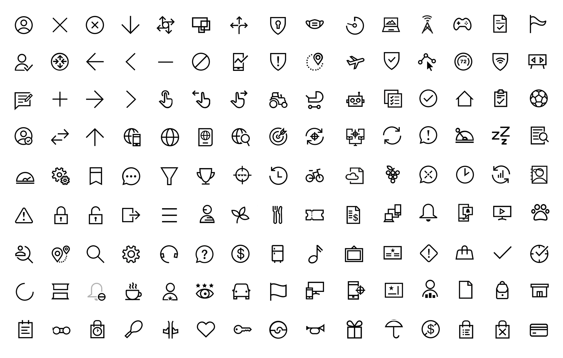
At the start of the total rebrand, the task of reimagining the icon system for Verizon came to our team at R/GA. The challenge was two part; defining the overall style of the icon design, and taking that style to then create a versatile, large scale system that works across all mediums, including broadcast, digital/web and print.

Where we began
To start, we reviewed and discussed the new brand tenets to ensure everything we created laddered back to the term ‘Radical simplicity’.
From there we explored different designs that connected to the voice of the brand. We liked a lot of the variations, but started to settle on ‘Straightforward’, and refined from there.
The newly developed Verizon iconography style was underway. The next step was to start testing in all possible scenarios. Refine, repeat.
The end result was a 300+ icon library for all creators
to use seamlessly across the Verizon brand.
Brand guidelines
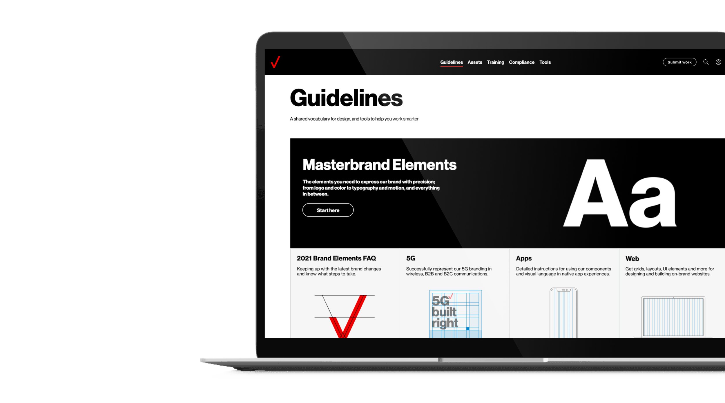
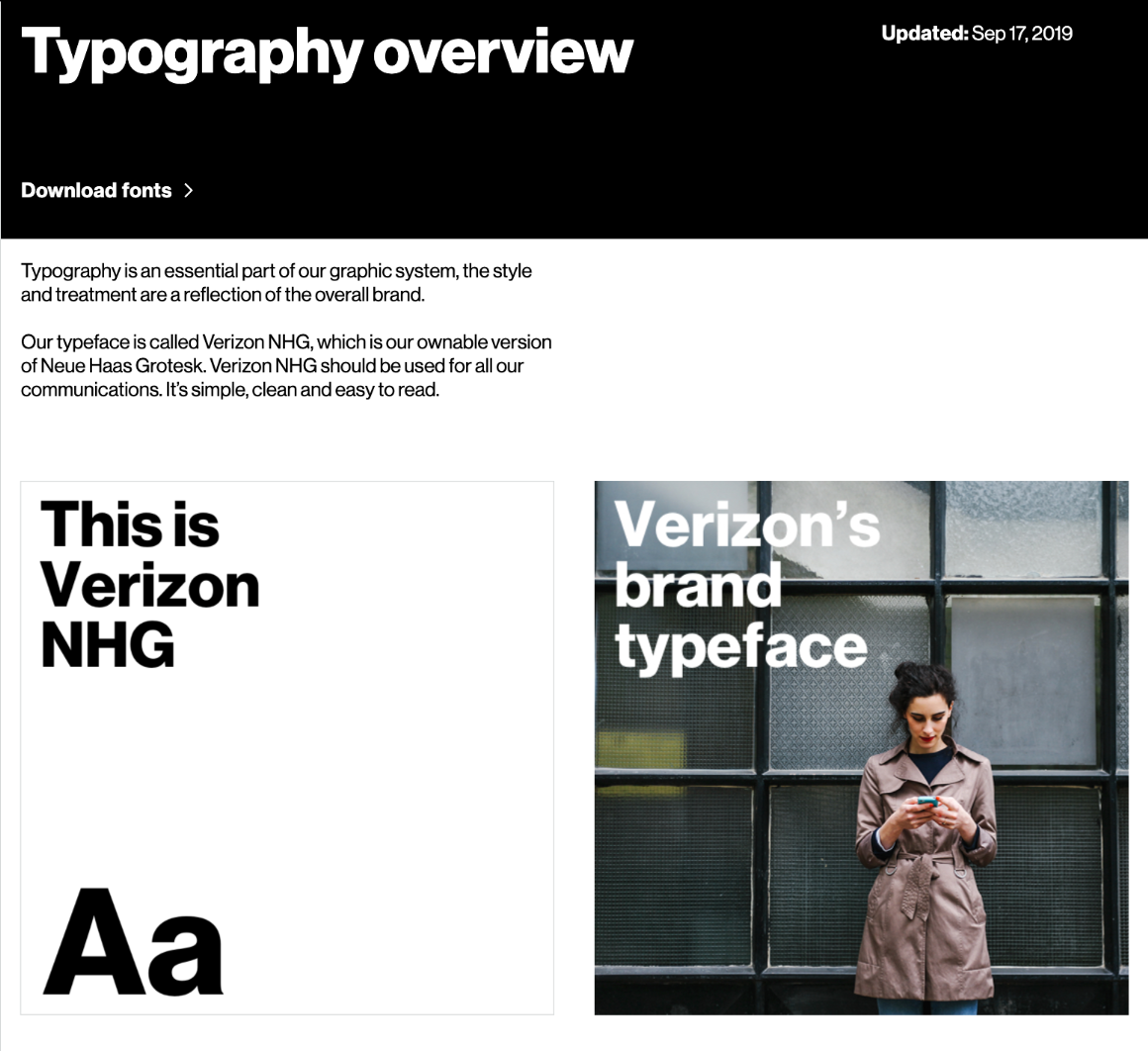
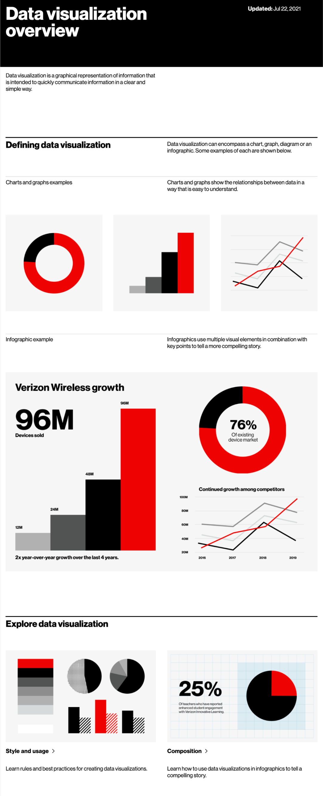
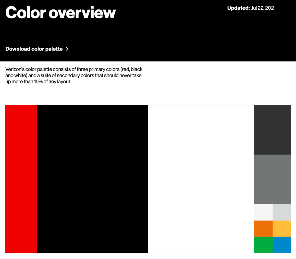
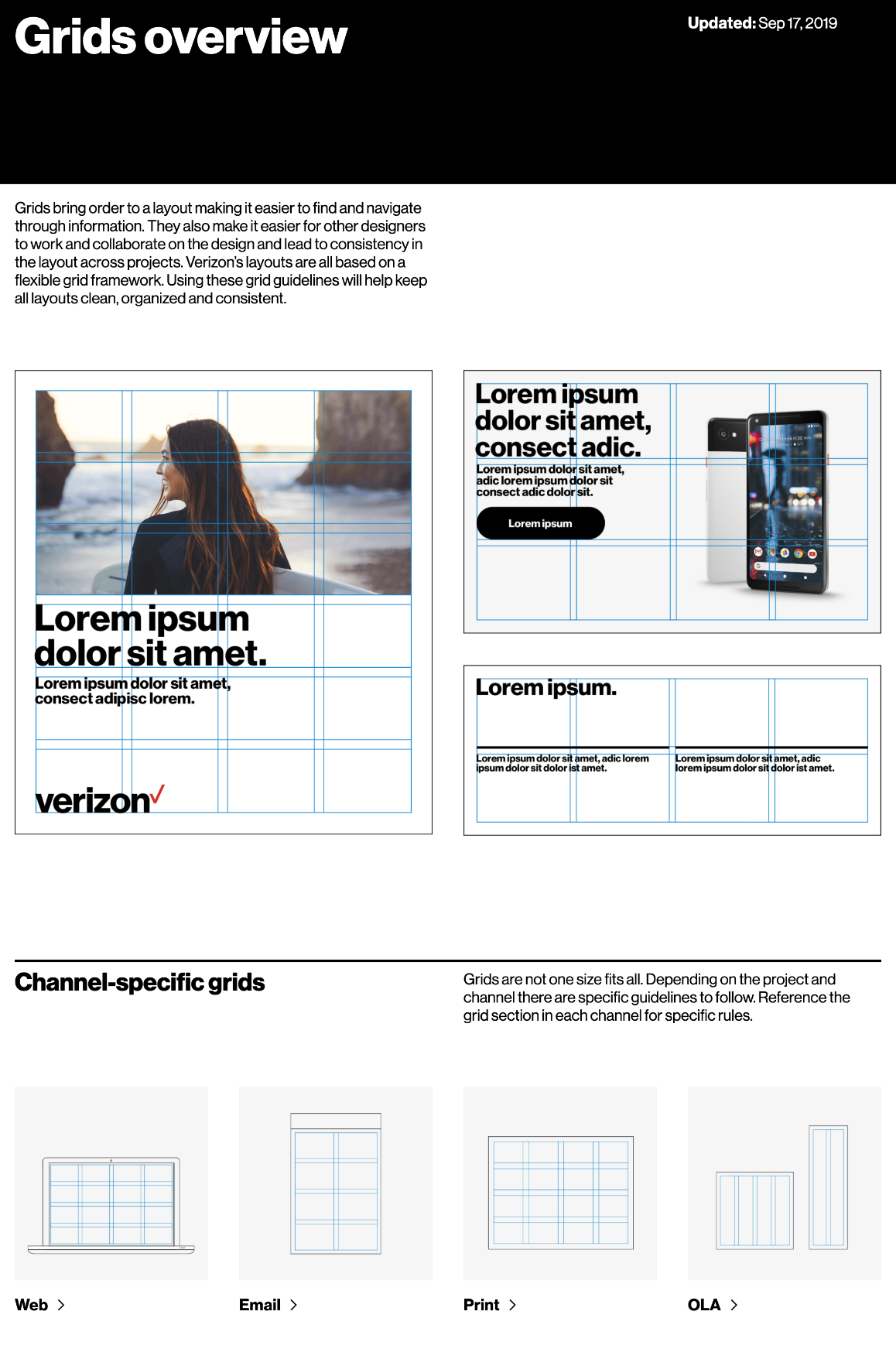
To start, we took a 300+ page guideline pdf and created an online experience that houses 30+ unique areas of guidance. From core brand elements like font and color, to specific channels like social and broadcast, the Verizon brand guidelines are an all encompassing and intuitive tool for all audiences.
Because brands are always living and evolving, it was essential for Verizon to have an easy to use CMS platform where brand elements can continue to be updated, as well as new areas of guidance developed.


Role:
ACD/Creative team lead
Core Team:
Lars Hannson
Chris Dowling
Marie Pacilio
Andy Catchaturyan
Collaborators:
Pentagram
Monotype
140


